elfs: (Default)
Last night, while meditating with my Muse headband, I encountered one of those Dark Behaviorist Patterns that are, to my thinking, one of the worst problems we have with apps and our networked world today.

The Muse Headband is gamified. I have no problem with gamification in general; I think it's an excellent documentation pattern, and done well is one of the best ways to get people to use your product effectively. But "done well" means done with the user's interests in mind; "done well" means executed with kindness and compassion for the user's time and patience.

The gamification pattern for Muse is straightforward. While using it, it categorizes your brain state into one of four ranges: agitated, neutral, calm, and deep calm. There's a main score, and for that score it gives you 1 point for every second you're "neutral" and 3 points for every second you're "calm." It also has a score for how many times you transition out of "agitated," and another for how much time you spend in "deep calm," but that main score is the big deal. Depending on various scores, you get badges, like any gamified environment.

Since I usually meditate for 25 minutes (booking a half hour, with setup and teardown), my theoretical high score is 25⨯60⨯3 or 4500. Yesterday I hit 4400.

I got three familiar badges: "Marathon" (meditated for more than 20 minutes, which I get pretty much every day), "Lucidity," (calm for more than 20 minutes), "Birds of Eden" (persistent deep calm). I've gotten other badges, including the one labeled "Perfect Timing," which is awarded when you meditate for 10 minutes or more, but experience less than 60 seconds of "calm," and "Wanderlust," which happens when your mind starts to become agitated late in the session, indicating boredom and a lack of focus.

But I got one unfamiliar badge: "Precision Shooter." I looked up the description: "Your score was exactly 4400." I went and looked back in my history; I'd received this score once before, for a score of 2900. "Precision Shooter" is awarded when your score is evenly divisible by 100.

That's not just a terrible metric, it's a psychologically manipulative one. Nobody's going to train their brain for that kind of precision. It's not just a meaningless badge, it's one that's awarded out of sheer luck.

When psychology students do the rat behavior reinforcement experiment, they divide the rats into three groups: continuous reinforcement, fixed ratio reinforcement, and variable reinforcement. The first get a food pellet every time they press a button; the second get a food pellet every fifth press; the third set get a food pellet after a random number of presses. It could be two in a row, or it could take fifteen or more presses until the food comes out.

Then the researcher turn off the levers.

The first group of rats gives up pretty quickly. It worked, and now it doesn't. The second group gives up after a little while longer. The third group never gives up. Never. The behavior pattern lingers for months. The rats' brains have become addicted to the reward system itself and they'll keep slamming that lever even when they're not hungry.

"Precision Shooter" is a variable reinforcement mechanism. It only happens at random intervals because you meditate. It's meaningless in terms of one's progress (whatever "progress" means to Muse), but it is a form of manipulation meant to make you to come back and try again. And because it's tied to an observable metric, it feels like an "achievement," so the initial hook is powerful, even if that metric isn't one over which you can exert any actual control.

"Precision Shooter" is a Dark Behaviorist Pattern, and Muse should remove it from the product.
elfs: (Default)
Really Bad Design What you're seeing here is the console of my car, a Subaru Outback 2014, directly above my left knee. There are two buttons side by side.

The one on the left is called Hill Holder, and it's a lifesaver for Seattle drivers. I have a manual transmission, and on Seattle's hills a manual transmission should be a nightmare, but hill holder makes hills simple: whenever the car is being driven on an upward slope and comes to a complete stop, hill holder automatically applies the brakes, and when I apply the gas it releases the brakes in a smooth transition to driving. It's a freaking miracle of modern science.

The one on the right is the ordinary parking brake. You know, the brake you leave applied whenever you park your car and leave it. It's essential that the button be available for manual cars because hill holder doesn't detect downward slopes, nor slopes too gradual to be problematic.

We have two buttons, side-by-side, down in an obscure, out-of-the-way corner of your dashboard. One of them you press every time you drive your car. The other you should never, ever have to press. The button's only purpose for being there is to deactivate hill-holder should you need to tow the car.

I am now in the habit of having to check, every time I start the car, to make sure I have not accidentally deactivated hill-holder. I should not have to make that check. But I do, because some engineer at Subaru didn't think far enough ahead about this incredibly useful feature.
elfs: (Default)
One of the things that I've been paying a lot of attention to recently is the design of everything things that I use. One thing that I've been using a lot, recently, is the Logitech Bluetooth Keyboard for the Apple iPad. And one thing that I've noticed is that there is one piece of very poor design on an otherwise excellent product: that poor design is the power indicator.

The keyboard has exactly one LED on it to tell you when it's in use. This tiny little green light, barely the size of a period on this page, highlights when you turn the device on and then fades away when it pairs with the iPad. When I separate the keyboard from the tablet the light doesn't come back on, but the keyboard keeps draining its battery. This is a design failure.

I was watching a documentary about Johnny Ive, the famous designer who works at Apple, and he was talking about the light on the side of their laptops that glows when the machine is in sleep mode, but fades out when you open the laptop. "That light," he said, "is only there when it's indicating something to the user." It indicates whether or not the laptop is ready to use, and nothing else. If you're using the laptop, there's no question of its readiness, so the light fades away.

The Logitech people saw only that the light faded away when you started using the laptop, and made the wrong assumption: The light fades out to indicate you're using the product..

The problem with this then becomes obvious: the keyboard has no alternative indicator. The power switch is cleverly hidden low on the right side of the keyboard. There is no way, looking at the keyboard itself in its normal orientation, to know if you're draining the battery. The indicator is failing in its duty: to indicate to the user information the user really needs.
elfs: (Default)
I read today about a recall of birth control pills. The detail that caught my attention was this:
Blister packs of the birth control pills were rotated 180 degrees, which reverses the weekly tablet distribution. This packaging error could cause women to take pills in the incorrect order and could lead to unintended pregnancy.
I suspect this means someone at the factory put the empty blister packs into the packaging machine upside down.

Buddha wept, this is Industrial Design 101. If you have an integration process where orientation is important, you avoid this kind of disaster by enforcing orientation through asymmetry. You can't plug a USB cable in upside down because the plug is asymmetrical along the critical axis. You shouldn't be able to load unlabeled blister packs into a machine upside down, nor should it be possible to fill and label those blister packs. All it would take is a notch in one corner to ensure orientation.

I'm sure press people would assure me "it's more complicated than that." No, it's not. I could be wrong about the mechanical particulars, but issues like this represent a systems design error of a real-world artifact: somewhere along the way a physical template, die, guide, measure, or clamp that could have been designed to prevent this from happening was not.
elfs: (Default)

Low Affordance
Astonishingly, I did spot one moment of less than excellent design: the trash cans. While, yes, everyone knows how to use a trash can, the degree of that assumption is strong in the design of the trash-can ingress.

If I had been designing the trash can, I would have molded the lids just a little bit, with a large descending plane sloping inward, and small, maybe two-inch ascending plane on the bottom to meet the descender. This would have helped communicate "push here," while reassuring the user that his hands were unlikely to slip and touch the interior of the receptacle. Not that Disney has much trouble with littering, but it would have been one more touch of perfection.
elfs: (Default)
Back when I worked for CompuServe, I was frequently rented out by my bosses to advertising agencies. I contracted as the backend guy for several, the most prominent of which, Saltmine Creative, I will always remember as the agency that loved the font Fiesta far, far too much.

This weekend, while cleaning up, I found a file with over a thousand URLs to other agencies active in 1998.

I was not surprised to discover that only about 8% of those URLs resolved to the same agencies. I would expect that. What did surprise me, more than anything, was that, of those agencies that were still around, most of them still looked the same. Of those that used Flash, more than half of them were still using the same flash app they had in 1998! It's been 13 years and yet the design sensibilities and graphic capabilities of these agencies hasn't seen an upgrade in 13 years.

That blows my mind. I want to say "If it works, stick with it," but Gnomist and Type Collective were cool back in 1998. Now, they look like poorly aging college students.

Even more sadly, some have gone backwards. Design Is Kinky used to have a new look every year; now they're just a Wordpress blog of things they're up to. A very nicely designed one, but not the impressarios of the 1990s.

Saddest of all are the pages marked "We're renovating. Be back soon," with HTTP "last update" dates in 2004. There were a few of those. TomoTomo has the same graphic it had 5 years ago, with "New site coming soon."
elfs: (Default)

I learned an important lesson today: never put on hold a book from the library that’s already listed on the shelves. Just go get it. If it’s on hold, they’ll take it off the shelves and put it “into the system,” which means you won’t actually be able to get it for 24 hours.

I also learned another important lesson. Always start a few load-creating automated tests, then go to the most hostile wi-fi enabled cafe you know and try to use your web application from there.

The King County Library System recently spent a lot of money upgrading their computerized system. It looks like there was a desperate attempt to make it “more 2.0″ by throwing a thin layer of AJAX into the mix: searches now update page partials rather than whole pages, and various divs for holds, fines, checkouts, and wishlists come and go as you click on the appropriate tabs. All fairly unimpressive, by my standards. The developers, whomever they were, used Adobe’s library as their basis as the Javascript is full of Dreamweaver-related (“MM_”) tags. Where they didn’t use Dreamweaver, they wrote the code themselves; there’s a strong Not Invented Here feel to much of the Javascript they used.

And I’m sure, when they first started out, it looked okay. They tried to search for a few books, the spinner spun for a second and then the page rendered. Only now, under load, the spinner spins for a several seconds, and then the page goes blank. A long pause later, the page begins drawing again. The clue that the spinner needs to stop and the signal that the data is ready to be drawn are two different signals.

There are several examples of this, but the book search is the most egregious. All in all, the upgrade has made a lot of people mad: renderers don’t work, often fail to deliver, time out without excuse. And this doesn’t have to be hard. KCLS has slightly under a million items, and had 21 million check-ins last year, or about 3 a second during business hours. Prodigious, but seriously middle-tier as far as businesses go. A modern implementation of the website should not be as difficult as they’ve made it.

This entry was automatically cross-posted from Elf's technical journal, ElfSternberg.com
elfs: (Default)

Recently, I had the pleasure of attending another of those Seattle Django meet-ups.  This one was a potpourri event, just people talking about what they knew and how they knew it.   I revealed that I’d written my first aggregator, and that seemed to be an impressive statement.  Apparently Django Aggregators (database conditionals that perform sub-selected summarizing or filtering events) is something of a black art, much like Wordpress Treewalkers were a black art I figured out in just a few hours.

Aggregators consist of two parts: The Definition and the Implementation.  Unfortunately, Django’s idea is that these are two different objects, bound together not by inheritance but by aggregation (both the definition and the implementation are assembled in a generic context, one providing access to the ORM and the other to the SQL).   The definition is used by the ORM to track the existence and name of the aggregate, and is then used to invoke the implemenation, which in turn creates the raw SQL that will be added to the SQL string ultimately sent to the server, and ultimately parsed by the ORM.

I needed to use aggregation because I wanted to say, “For any two points’ latitude and longitude, give me the great circle distance between them,” and then say, “For a point (X, Y) on a map, give me every other place in the database within n miles great circle distance.”

The latter was not possible with Django’s Queryset.extra() feature.    You can add a WHERE clause, but not a HAVING clause, and this definitely requires a HAVING clause when running on MySQL.  Using an Aggregator with a limit forces the ORM to realize it needs a HAVING clause.  Besides, it was a good excuse to learn the basics of Aggregation. Ultimately, I was able to do what the task required: find the distance between any two US Zip Code regions without making third-party requests.

I make absolutely no promises that this code is useful to anyone else.  The Aggregator is definitely not pretty: it’s virtually a raw SQL injector.  But it was fun.  Enjoy: Django-ZipDistance.

This entry was automatically cross-posted from Elf's technical journal, ElfSternberg.com
elfs: (Default)

And while we’re on the topic of helping users discover the rest of your website, I can’t help but recommend Lisa and Jonathan Price’s  Hot Text, a fabulous book thick with examples on how to shorten, tighten, punch-up, clarify and atomize your documentation so that it’s easier to use and re-use in different contexts such as gamification.   The book is ancient by Internet standards, published in 2002, and frequently available in used bookstores.   Although much of the information is pre-DITA, the basic approaches and guidelines are too useful to ignore.

Their website, however, looks so dated and misaligned that I can’t help but wonder if the Prices understand anything about the web other than documentation design.

This entry was automatically cross-posted from Elf's technical journal, ElfSternberg.com
elfs: (Default)

I love being able to combine one of my favorite design techniques with my latest infatuation.  It makes my hair tingle.

Gamification,” as any buzzword-compliant high-priced consultant will tell you, is the process of adding game mechanics to a website in the desperate hope that trivial reward mechanisms– badges, stickers, and made-up titles straight out of your D&D years– will encourage your customers to come back and visit your website again.  At least, that’s what gamification appears to be on the surface.  That is a shallow and useless description.  Badges, “experience points” and useless labels will not encourage anyone to use your website.

Story cards” are a specification tool used in Agile and eXtreme Programming development.  A story card (usually a hand-written 3×5 card) describes the “happy path” of a user doing something useful with your software: “The user logs in,” “the user searches for a movie,” “the user watches a movie,” “the user likes a movie,” (here, “likes” is emphasized to record that “liking” is an application-specific verb).  (I use the example of a movie-selling website because I work for a movie-selling company.)  Before a development sprint, the team sorts the cards by priority, makes estimates as to how long it would take to write code that would fulfill each story, and then begins bargaining to establish who has responsibilities for each story, along with the usual ensuring that one developer’s track will not confound another’s.   A sprint is made, and then the developers assess.  A “story” is a small, atomic action a user can take with your software.

Deep, rich websites typically have dozens, if not hundreds, of stories.   Often, many of those stories will go completely ignored by your users.   They may be obscure or difficult to find in your navigation.; alternatively, their value to your users may not be obvious.  As a website owner, you want users to try out every story you have; you never know which constellation of the many stories your website supports will be the one that hooks any individual user to engagement.   If you don’t encourage your user to try out everything, you’re wasting your website.

Gamification helps prevent this waste.  It’s is an incredibly easy concept to grasp; you could write a Django app or Rails plug-in to support it in a single afternoon.   The gamify application looks like this:  For any given story (usually, “gamification experts” will call this a “user action”), the customer accrues a certain amount of currency. (Do not be confused by this word.  It does not imply money, or “virtual currency”; it’s merely a tally of whatever it is your tracking the accrual of: experience points, votes, the number of times a user has reviewed a movie, the consistency with which a user has visited your website.)  At some point (maybe even immediately), your software awards something to the user.

This is where the whole “badges, levels, titles” thing gets confusing– and annoying.  Because rarely does the user want a badge, a level, or a title.  What the customer wants is enlightenment. What you want is engagement. What your software awards to the customer should not merely be a badge, a level, or a title– your software should award the customer the information and tools needed to engage more.

Gamification is not turning your website “into a game.”  That’s stupid.  If I want a game, I’ll fire up the Playstation.  Better yet, I’ll go find my kids and a deck of Uno cards.  Gamification is the mechanism by which your website’s user manual is turned into easily digestable and entertaining awards, leading users by the hand from one capability to the next.

So get out your story cards and arrange them, not in the order in which they could be accomplished by the developer, but an order in which you want a customer to encounter them.   Sometimes, this order will be linear, but more often not.  Lay the cards on the table, with “sign up” at the top, and then the “natural” things the user would do as a second line of cards underneath, then more complicated things.  Maybe down at the bottom you could put the “epic win” cards of your website: the most popular filmmaker, or most respected reviewer, or whatever.   Now, for each card, you have to come up with a parallel game card: write down what currency we track in this story, and when the user has completed the story, what award will lead the user to other cards.  The award is a fragment of your user manual: “Now that you’ve done X, you can also do Y!”  Now, as an added layer, write a tracker for each event, tally the user’s currency, and design the award.

Gamification is the process of enlightening your users about how they can grow as users of your website.  If you have mild engagement (that is, the customer didn’t flee at the first sight of your home page), you have an opportunity to educate the user about what to do next.  You can do that with a Big Page Of Instructions, or you can do it incrementally, gradually, and with a sense of achievement.   The mechanics are easy.  So damn trivially easy I don’t see why VCs are giving third-party “gamification tracking” companies like Big Door and Bunch Ball millions of dollars.  The real trick to gamification is at the other end, at your website: your active customers know what’s epic and important about your website.  Do some analytics, figure out what your active customers already know, and then figure out how to lead new users down those same pathways in a gentle and entertaining way.

This entry was automatically cross-posted from Elf's technical journal, ElfSternberg.com
elfs: (Default)


Whoever designed this cover deserves an f'ing ASME (American Society of Magazine Editors) best cover award. Brilliant, immediate, provocative, and insightful all at once. Clear communication in a double-take. Kudos!
elfs: (Default)

Every day, I have little stabs of envy when I see the Photoshop tutorials for zarious cool things people do with Photoshop, and wonder why we can’t do that with GIMP. Well, we can. In that spirit, I’ve taken How to Create a Stunning Vista-Inspired Menu and reproduced it with the GIMP.  So I tried to reproduce the results.  The work is pretty close.

1. Create a new canvas, 600 x 335, background white. Add two new guides (Image -> Guides -> New Guide), one at 285px and one at 310px.

2. Create two new layers, 600×25 pixels. Label them “upper bar” and “lower bar” (if you can’t figure out which is which, well…), and put them into the 25-pixel high gaps created by the guides.

3. Fill the top bar with a vertical gradient, light on top, dark on the bottom, #787b7d to #35393d. Fill the bottom bar with a vertical gradient, light on top, dark on bottom, #0c0c0c to #000000. Set the bars to 90% opacity, normal over the white background.

4. Draw a new line across the very top of the top bar, color #484b4d. To do this, from the top bar, select a 2-pixel high area at the very top of the bar (from the guide to guide +2) stretching the entire width of the area. Copy, paste as floating selection, then click “new layer” in the new layer dialog to make this its own layer. Fill with color. Duplicate this line and put it right under the first line; fill with color #9fa2a4.

5. Create a new layer, 2 pixels wide and 19 pixels high. This will be the top half of a separator bar for your menu. Place it so the bottom of this tiny layer rests on the second guide. Fill it with a gradient, #4d6672 #676a6d top to bottom.

Create a similar layer, 2 pixels wide and 21 pixels high. This will be the top half of the separator. Place it right under the other half, and just fill it with #43474b. You can merge this layer down with the one above, and just have a “divider.”

At this point, it might be wise to delete the guides. I found they weren’t helpful, and often misplaced the divider.

Clone the divider (Layer Dialog, duplicate button on the bottom) and place it at regular intervals, to make the menu. Fill the space between with text, color #ffffff.

6. Pick a background. I used Forest on a Foggy Day (CC Licensed), but you can surely find your own favorites from around the net. Crop and scale it to the size of our demo, and place it as the background layer. (You may choose to delete, or merely cover, the original white background.)

7. Now for the glassy see-through “Vista” effect. Click on the background layer. With the select tool, select a rectangle about 200×160, starting at 105px down and (here’s the tricky part) -15 pixels left. Select “rounded corners”, 15px radius. Copy, then Paste As New Image.

With the new image, do a Gaussian Blur, 10px radius, then up the canvas size by 10 pixels (Image -> Canvas Size), and using the same dialog center the image on the new canvas. Then, with the image, add a drop shadow (Layer -> Layer Effects -> Drop Shadow, Opacity 60%, Angle 135°, Distance 2, Spread 5, Layer knocks out drop shadow: Yes, Merge layers: Yes). Crop the image to its essentians (Image -> Autocrop).

Copy the new image, then go back to the other image and paste it. If you did it right, you left the old selection active, and the new selection will drop into place. If not, then you should paste it as a new layer and position it by hand at 0×105 (The part to the left was cut off in transit to the new image, remember?).

8. Add text to your glassy portion, and user the Layer Drop Shadow as described above on the words. You may have to mess with it a bit to get it right, but the angle must match the angle of the glass, or it won’t look right.

The free template for this Photoshop to GIMP experiment is available: Vista Style.

This entry was automatically cross-posted from Elf's technical journal, ElfSternberg.com
elfs: (Default)

Following up on the The Onion’s announcement that they’re using Django comes this priceless discussion of the technical challenges of doing so with several members of The Onion’s technical team. They were using Drupal before.

Among the things I discovered:

  • Grappelli, a customizable theme for the Django admin
  • uWSGI, a high-performance WSGI container separated from Apache,
  • HaProxy, a viable open-source TCP/IP Load Balancer.

I’m constantly reminded, when I work on IndieFlix, “You’re not YouTube. Don’t code like you are ever going to be YouTube.” And they’re right. If I ever reach that level of technical difficulty, I’ll deal with it then. But we very well could have traffic issues similar to The Onion’s, and that’s not a bad target to aim for.

Also not to be missed in this conversation: The Onion cut 66% of their bandwidth by upstream caching 404s

This entry was automatically cross-posted from Elf's technical journal, ElfSternberg.com
elfs: (Default)
Brad DeLong thought of it first. I'm just better at Photoshop The GIMP than he is.
elfs: (Default)

The worst kern.
Look at the space between the R and the first E above in 'TREE.' That has to be one of the worst kern jobs I've ever seen outside of a letterboard or a kindergarden. Don't these people appreciate just how ridiculous they look?
elfs: (Default)

I recently implemented a new subsite for IndieFlix using LessCss, the Leaner CSS metaframework. LessCss is a programming language that abstracts CSS out into a hierarchal language, where instead of writing:

#header { ... }
#header img { ... }

You write:

#header {
    ...
    img { ... }
}

Which, believe me, makes a whole lot more sense. Even better, if you’re fond of the clearfix technique, then you’ll see why I fell in love with LessCSS. I had a long sidebar object, and I realized that I needed to make it clearfix to deal with some float issues. I had .clearfix { ... } defined already in my CSS, and I had my “.social-networks” class that I wanted clearfixed. LessCSS let me write:

.social-networks {
    .clearfix;
    ...
}

And it all worked the way I expected it to, without my having to clutter up the HTML with layout hacks.

Yes, this means that there are duplicates in the CSS LessCSS actually spits out, but that shouldn’t matter, any more than you care about bitsequence duplication in a large C++ program’s object code. I tend to look down on metaframeworks; my experience with using Ruby to write Scriptaculous code, or GWT, is that unless I want to jump through strange hoops I’m limited to expressing in Javascript only what can be expressed by the writers of the Ruby or Java-based framework.  This problem is made worse by the promise of not having to learn Javascript to be expressive in it.  I call shenanigans.   The win for using any framework has to seriously overwhelm the loss of expressiveness. I don’t bemoan losing the expressiveness of assembly language when I write in Python (although if I did have a problem that needed assembly language, I’d write in ASM, build a C wrapper, and compile the thing into a Python module… because I know all three of those languages*), and the only thing I lose using LessCSS is browser hackery, which I shouldn’t be doing anyway.

The containerization of cascades is such a clear win for me that I can’t imagine going back to doing CSS by hand. Well, I can, I just wouldn’t want to.

LessCSS does not carry your CSS comments from its source file to the CSS output, so it’s inappropriate if you need browser hacks that rely on poor comment parsers (I’m looking at you, Opera) or have alternative uses for comments in CSS (such as Wordpress’s style.css file does).


[*] Okay, I studied Motorola 68K assembly, which is a far cry from x86 assembly. Back in the 80’s, everyone “knew” the x86 chipset was junk and Motorola’s native multitasking cores were the future. Then Apple had to screw up using the multitasking features, Amiga and Atari blew it, Microsoft, IMB and Intel continued to chug along, and we’re left with the x86 series. This entry was automatically cross-posted from Elf's technical journal, ElfSternberg.com
elfs: (Default)

Sharper FX

They do nothing but churches. Black churches, too. Sharper FX is an 11 on the scale of Manliness. Watch some of the Flash splash pages. They’re amazing. I love this site.

This entry was automatically cross-posted from Elf's technical journal, ElfSternberg.com
elfs: (Default)

A friend of mine pointed me to the website of CB Richard Ellis, a real-estate investment and management house with a big footprint here in the Pacific Northwest.

Their hiring website is a horror. No, really, go look, unless you’re an epileptic. (Sadly, the effect only seems to be present for Firefox users. Opera, Chrome, and IE6 didn’t show the evil.) Then go read The Federal Electronic and Information Technology Accessibility Standards, better known as “Section 508″, and document how they’re out of compliance. (Hint: Section 1194.21k).

I fully believe it’s possible to design very attractive websites that don’t violate Sec508. CBRE has failed on a galactic scale with this abomination.

If you’re not a Firefox user, here’s the horror: Every input button has this added to its CSS: text-decoration:blink;.

Yes, that’s right. Every input button is set to “blink.” I don’t know what’s worse: that the people who wrote their site thought that was cute, or that Firefox honors it.

This entry was automatically cross-posted from Elf's technical journal, ElfSternberg.com
elfs: (Default)

Cheesy law firm website templates are multi-colored, busy, poorly laid-out, and tend to go for light-on-dark themes where the seriousness of the business is emphasized by leather and wood textures, spot lighting, and so forth.

A review of the websites of the largest law firms in the US shows two things: a lot of them don’t have their Internet stuff together. Those that do go for very clean designs, solid color schemes, and traditional dark-on-white themes where readability is at a premium.

ElfSternberg.com
elfs: (Default)

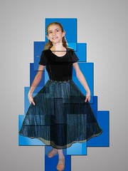
I’ve been trying to do a design thing every week.  I doodle a lot, and make lots of scratches, and I might show you a few of those, but as a web developer I have to keep my hand into the design side of things.  Recently, the magazine Photoshop User had an article on doing “Multi-colored Box Tiles”, an effect they consider “a classic.”  It turned out to be significantly more difficult with the Gimp, but I did finally manage it.

Take your subject in front of a neutral background.  Here, I’ve put my daughter, Kouryou-chan in front of  a medium blue background with a slight lighting gradient.  Open the Layers dialog (Windows -> Dockable Dialogs -> Layers, or CTRL-L).  Now create four new layers (Layer -> New Layer) above your subject.  Select the first new layer, set the pen to color #cccccc.  Create a couple of random boxes, making sure that one encapsulates the head completely (otherwise it’ll just look weird).   In the second layer, do the same thing, but using pen color #999999. It’s okay if the boxes overlap.  In the third, again but this time with color #666666, and in the fourth with color #333333.  You should by now have completely obscured your subject.

For each layer, set the Mode to Overlap (On the layer dialog, Mode -> Overlap), and play with the opacities, and you’ll get a nifty mosaic effect.

Now for the 3D effect, here’s the fun part.  Create a new image, transparent background, big enough to hold your subject.  Go back to your working image, pull up the selection editor (Select -> Selection Editor).  Pick one layer and click on the selection editor.  You should see that layer’s boxes highlited– but the selection is inverted, so Select -> Invert Selection.  Now copy the selection and what it contains (Edit -> Copy Visible).

Now go to your blank image and Edit -> Paste As -> As New Layer.    If you’ve got a complete copy of Gimp, you should have Layer Effects installed, so you can just Layer -> Layer Effects -> Drop Shadow, but if not, drop shadows are simple: Duplicate the layer, go to the new layer and fill it with a dark grey, blur the edges (Filters -> Blur -> Gaussian Blur), then position in behind your existing layer as you like.  Once your drop shadows are nice, merge down the existing collection of boxes on top of its drop shadow layer, so you get a few random boxes and their drop shadows.

Do this with all four layers.  Now that you’ve got all four layers on your new canvas, it’s time to play puzzle, moving the four layers to construct the whole image again.  You can set the upper layer to 50% opacity; that’ll help make sure you’ve merged the textures correctly.  It’s just a lot of fiddling; up the magnification to 400% or 800%, that’ll also help a lot.  Once you’re done, set all four layers to 100% opacity again.

For the new background, I just picked a nice grey with a gradient, the glow centered behind the subject’s heart.

This entry was automatically cross-posted from Elf's technical journal, ElfSternberg.com

Profile

elfs: (Default)
Elf Sternberg

May 2025

S M T W T F S
    123
45678910
111213141516 17
18192021222324
25262728293031

Syndicate

RSS Atom

Most Popular Tags

Style Credit

Expand Cut Tags

No cut tags
Page generated May. 25th, 2025 07:41 am
Powered by Dreamwidth Studios