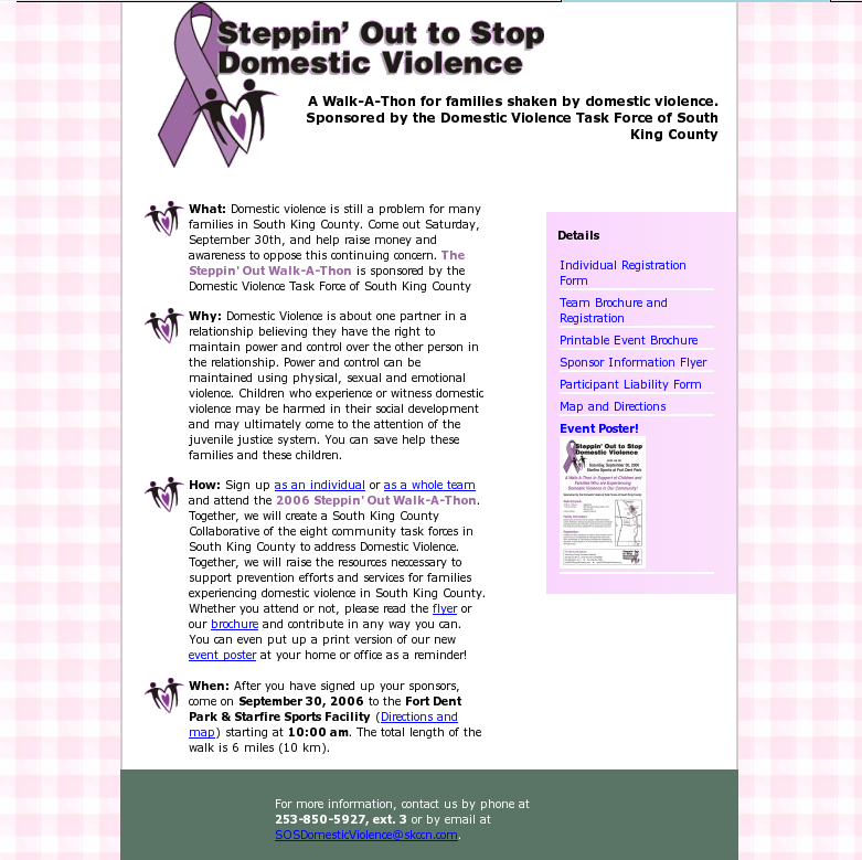
In early 2007, the South King County Domestic Violence Task Force asked me to design a simple "poster"-style website for them for their Stop Domestic Violence walk-a-thon. Now, I don't remember all of the details about why they asked me; it had something to do with their graphic designer being some old hand with lots of commercial paper skills but no HTML, and they needed the HTML
now. That thumbnail to the right (click on it for a bigger screenshot) is what I came up with, based on a PDF of the original trifold pamphlet. I used their color scheme and riffed it with a pseudo-calico wallpaper to suggest home coziness, and then pulled out my color wheel to get the dark green contrast into the footer. It's a little distracting, now that I look at it, but it's okay. The bullets I hand-cleaned from a crop of the banner, and getting the DIV into the right place was a lot of fun, let me tell ya. I'm not a graphic designer; most of my intelligence is back-end implementation of the stuff designers do. But this was very straightforward; anyone should have been able to handle it. I think the whole design took me maybe four hours once I put my mind to it.

This is what the designer came up with now that she's learned a little HTML. It's a mess. First, the logo isn't properly dithered, so it has all those horrible jaggies on it. The color scheme of dark pink and gray suggests sexual violence (if I were to post this color scheme to
ColourLovers, I'd name it "date rape"), and the lowered contrast of black and gray is just irresponsible. The buttons to the left are image tags, badly mangled. And why the heck is there a visitor's counter on the bottom? Why is the black separator so big, and why doesn't it really separate anything since the pink of the menu bleeds into the pink of the background?
I guess I'm miffed. What was wrong with my design that the 2008 version is considered "an improvement?"
no subject
Date: 2008-04-04 07:45 pm (UTC)The source code for that page is a WRECK. First of all, there's no Doctype at all, then she's got acres of code space dedicated to outdated javascript image swap crap that could be done so easily with CSS... but obviously she hasn't a clue what CSS is because the whole site is built with TABLES and FONT tags.
Good lord, it's like time traveling back to the web design world of 1996.
Sadly, most people who don't know any better really don't know any better.
On the bright side, at least she didn't include a BLINK tag.
no subject
Date: 2008-04-04 07:52 pm (UTC)no subject
Date: 2008-04-04 07:52 pm (UTC)no subject
Date: 2008-04-04 07:55 pm (UTC)But yeah, aside from the code horrors, it is one hell of an ugly site!
no subject
Date: 2008-04-04 08:01 pm (UTC)There's a small part of me that's extremely grateful she's never heard of scriptaculous or EXT-JS.
no subject
Date: 2008-04-04 08:24 pm (UTC)no subject
Date: 2008-04-04 09:39 pm (UTC)Also, hon, the woman who originally contact you last year to do this isn't in the district anymore..she moved. So she doesn't know how to get hold of us anyway. :( She probably is looking at that and wishing that she knew where we were.
no subject
Date: 2008-04-05 04:15 am (UTC)And really, she had to do *something* to show her bosses she's doing something...